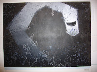
Ok, Museum Time. We went to the Museum of Contemporary Art (just a short pleasant walk from our doorstep!) the other day. Two big things are happening there : a Koons retrospective, and a "Look at all the great stuff we have in our collection!/F-you Art Institute" show.
The Koons Show - I'd heard a lot of discussion before hand, and really who hasn't heard a lot of discussion about him, in general? Anyway, this is a big show - and featured all the greatest hits. The hanging blue heart, the porn, the Michael Jackson. This show was more about finally seeing the objects behind all the discussion, kind of like scratching an itch. However, issues of originality/"aura" abound, as one realizes that his work takes a sharp sarcastic position about the whole idea of high-art, jaw-dropping, object worship. The high level of technical virtuosity he presents just furthers that whole shiny/sexy/playful allure the objects have. Like he's mashing all "good" things together to talk about the people/cultural practices that do that for real.
However, that could mostly all be understood without seeing the show. The most visceral reaction we had looking at this work up close was just laughing. Whatever else his work does, and there's a lot, seeing giant ceramic kitschy replicas of the cultural detritus we've all come to filter out is just funny. Giant teddy bears, inflatable toys, balloons, sex, cute kids, ..you know. All funny things.
Oh, and he went to school here.
The Show-Off Show- Ok, so the Art Institute is opening a new Contemporary wing this spring, so it seems the MCA is saying "well whatev, we've been doing this way longer than you. Look at my Naumans. Oh, and did I mention Kara Walker? and the Hairy Who? Oh, and let me remind you about BRUCE NAUMAN." So of course, this was enjoyable because they were showing off some of their best stuff.
Personally, I developed a big crush on Bruce Nauman. Perhaps it's like one of those things when your friend says "hey, look at that cute boy!" and you say "oh, yeah, come to think of it, he is cute!" But really, I think this boy was always cute, no matter what the MCA says. There was a piece featuring a video projection of him beating a large sack full of something, relentlessly, brutally. In front of it was a yellow plexi-glass architectural construction, than doubles as a rat maze. Small TVs featuring the beating video a pressed up against the plexi, beaming that violence into this opressively yellow, disorienting environment. A camera up above pans the room methodically, periodically splicing shots of the viewers in to the projected video. We are all complicit. But there's nothing that can be done. And we're so busy worrying what's going on in this big fancy artificial construction.
Another Nauman piece that I was happy to see again features two televisions, side-by-side, one with a frontal shot of an older-middle-aged white woman and the other a middle-aged black man. They are each reciting a series of conjugations of states of being. "I am -------. You are -----. We are -----. This is ------." where the blanks are filled in with such things as : a good man/woman, a bad man/woman, evil man/woman, fun, boring, having sex... " etc, creating a litany of very common, yet ultimately revealing and all-encompassing statements of self-assertion. The two actors inflect the phrases differently, so "this is fun" can be joyful or sardonic. You probably are familiar with this work, so I'll stop.
Ok, I've never been a big Hairy Who fan. But I'm in Chicago now, at SAIC, and they are everywhere I look. And they seem to be a corner-stone to the Art Institute/ MCA turf war, as each is featuring them similarly at the moment. But MCA's is bigger.
I'm done now.
Thursday, September 11, 2008
Sunday, September 7, 2008
First Friday in Chicago's West Loop
So we couldn't see all the art to be had on First Friday, which is a great problem to have. Except First Fridays, as everywhere, are more about being seen than seeing, so whatever. I'll just point out the highlights.
Three Walls Gallery - "Sin Will Find You Out" - Paintings and a video - The paintings were heavily patterned, brightly colored, large, and painted directly on canvas that was stretched to the wall with grommets (which Eric liked. He likes metal things.) One grouping was a series of abstracted, stylized super-hero masks, and the other was a series of similarly stylized crosses. The treatment of each can best be described as incredibly "fancy." Like they almost should have been made out of glowing neon lights and glitter, or something. So yes, the impulse towards organized religion and escapist super-hero fantasy is very similar, if not the same, in governing people's ideals, behaviors, aspirations, and moral codes. And both are very decorative and fancy.
The video, which seemed to be much stronger, was a series of urban scenes, shot at night, as though on a quest for something. Or perhaps to set the scene for some larger action later. The camera does find something: a guy dressed up as Spiderman, lurking in some sort of dark basement. Spiderman lurks and tries to hide from view, but the more this happens the more futile his hiding seems- it becomes more obvious that this is no superhero with magnificent powers, but a guy dressed up as some thing he's not, and perhaps a little sensitive about the fact that we caught him at it. He doesn't want to be seen - he doesn't want us to examine his outfit perhaps, and see how fake it is. ( I would have been happy with just this sequence, but I guess I like simplicity.)
Western Exhibitions - Walking Books - I like Stan Shellabarger ( and his partner Dutes, who wasn't really part of this show, although I saw him there) so I was happy to see this show so soon upon arriving in Chicago. This work continued in the conceptual framework the two have established in their collaborative work - repetitive creative acts that build up to something larger, usually both creating something and destroying/obstructing something in the process. Stan had a series of "walking books," in which he walked repetitively on paper in fixed paths and differing surfaces, until the texture of the surface wore through the paper or left a significant mark. This left intricate, almost lace-like holes and patterns in the papers, which was then displayed, both as an object and a record of an action.
Kavi Gupta Gallery - NPR (Neighborhood Public Radio) - A collaborative group that has figured out how to make radio and TV transmitters, as well as intense electronic sound machines, out of pretty much anything. They have been around for a few years (were at the Whitney Biennial this year) and focus on creating community-based radio broadcasts, on their home-made radio transmitters. Ok, I really don't know all that they do, or how it all works, but this show featured them in a room, making some wildly intense sound mixes using all manner of electric equipment, including electronic toys and vintage radio thingies. They were making some of the stuff right there during the performance, which was mesmerizing, for no other reason than they were quite obviously totally enjoying themselves, getting caught up in the nearly hedonistic act of making SO MUCH NOISE. And with things they made themselves, out of junk. They are pretty in that way - a DIY/populist approach to the commercially dictated sphere of media and sound. And they're giving workshops over the next month so we can all learn how to take over the airwaves.
And if you're interested in further discussion of the evening, check out PhotoAwesome, where Walker posted a video of us acting all giddy and gleeful at being in Chicago.
Sunday, August 31, 2008
First Art I've Seen Since Moving To Chicago
I went to this grad student reception thing at school (SAIC) the other night - it was in their (I mean OUR) new huge exhibition space (where I will be having my MFA show, some day). They opened the space with two shows - "Ahh....Decadence!" and "Department(Store)".
To be honest, I didn't get the best look at the whole Decadence show - there was free food, the place was huge, and I had to catch a commuter train. But I'm going back later. The show explored themes of ...decadence..in many forms, tying together the sorts of mania that comes along with doing anything over-the-top. So there were lots of crazy colors, fast videos, sex, pink, orange, shiny things, spastic things, and pink. It seems especially relevant, given the status of ..things..and the easy distraction of the public by shiny, fast things, what with this election and all. Maybe that's a stretch. But it's important to understand our relationship to the gaudy, staged, "decadent" forces in our lives.
Ok, and now the Store. Exciting! A huge warehouse - size exhibition space filled with rows of empty display cases like the kind used in retail. They are also shiny and attention-grabbing, but in a more apocalyptic way. The "store" apparently refers, in part, to the building's historic use in retail. The plan is to allow people- students, whoever - to submit proposals for displaying things in these cases. This allows people to interpret the situation of a room full of retail cases as they wish; I'm assuming it will go along the lines of obsession, artificiality, economic issues, and exhibitionism.
Saturday, August 30, 2008


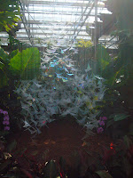
This week we had a chance to see Atlanta's "Art in Motion" exhibit at the Botanical Gardens in Piedmont Park. Much of the sculptures were metal mobiles of different sizes and shapes. Most of the work was geometric with hard lines and straight edges. Yet much of nature is soft and curvy so there was a noticeable disconnect. One artist's work was smart on how they used the idea of motion and connecting inertia with nature. The favorite works allowed audience participation. There has been a strong pull in contemporary art to acknowledge the viewer as the most effective component to complete a piece. Although many of the structures left much to be desired, we found a few that made the visit worth the price. These public pieces were at least accessible if not always warm, but the gardens themselves were inviting and peaceful. We strongly suggest a stroll through the green houses and around the grounds to all the fountains. A question that we asked each other was "Is nature drawn to symmetry?" We could site arguments for yes and no. What do you think?
Friday, August 29, 2008
Subscribe to:
Posts (Atom)


